An inverted yield curve has preceded every United States recession since the 1960s, but the 2022–2024 episode inverted for roughly two years — the longest stretch on record, per Treasury par yield data — without a recession following on the historical timetable. That fact alone justifies re-reading the fine print. Market Today publishes information, not investment advice; what follows is an audit of the signal, not a forecast of the cycle.
What exactly is an inverted yield curve?
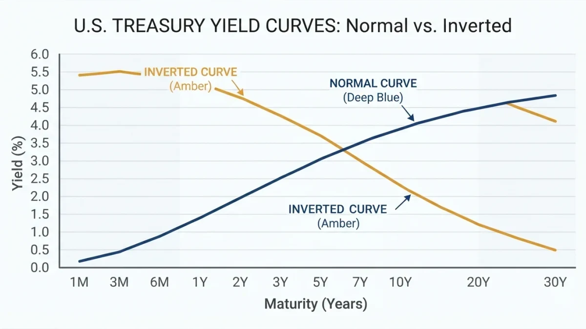
It is the condition in which short-term Treasury yields sit above long-term yields — the interest-rate equivalent of a shop charging more to rent a ladder for a day than for a year. The two most watched pairs are the 10-year minus 3-month and the 10-year minus 2-year spreads, both published daily from Treasury par yield curve rates. Normally lenders earn more for longer commitments, so a persistent inversion signals that markets expect materially lower short-term rates ahead — usually because policy is tight and expected to loosen. Inversions measured in basis points deepened through 2023 before normalizing in late 2024.
Why did the signal earn its reputation?
Because its hit rate was remarkable for a single number. Each American recession since the late 1960s has been preceded by an inversion of the 10-year minus 3-month spread, with recessions typically beginning six to twenty-four months after the curve turns negative, according to the historical record compiled from Treasury and Federal Reserve data. No false positives were recorded across five decades — until the 2022–2024 episode forced analysts to add an asterisk. A track record built on roughly eight observations is impressive, but statisticians would call the sample small, and honest users of the signal say so.
What actually happened in 2022 through 2024?
The Federal Reserve raised the federal funds rate from near zero in early 2022 to a 5.25–5.50 percent peak by mid-2023, per Federal Reserve policy records, and the yield curve inverted in 2022 and stayed inverted into 2024 — longer than any prior episode. Economists at the Federal Reserve Bank of New York, whose recession-probability model is built on the curve, watched implied odds rise to levels that historically accompanied recessions. Yet the National Bureau of Economic Research, the arbiter of U.S. cycle dating, has not declared a recession for that window as of this writing. The curve's most famous streak ended not with a contraction but with a debate.
Why might the signal have produced a false positive?
Three candidate explanations dominate the literature. First, quantitative easing and the Federal Reserve's bond holdings compressed the term premium — the extra yield investors demand for long maturities — making inversions easier to reach mechanically. Second, this cycle's tightening worked through interest-sensitive sectors like housing quickly, slowing demand before broad job losses began; the inversion arguably did its work by slowing credit rather than by predicting a crash. Third, a large share of long-duration buying comes from price-insensitive holders such as pension funds and insurers, which dampens long yields for reasons unrelated to recession odds. Each explanation has evidence; none is settled.
Is there a better formulation of the signal?
The more defensible reading treats inversion as a statement about policy, not a countdown clock. An inverted curve says markets expect the central bank to cut rates substantially — and rate cuts of that size historically arrive when growth has weakened. The signal fails when policy tightens, cools inflation, and then eases without a contraction, which appears to be the 2022–2024 pattern. Analysts who pair the curve with real-time data — jobless claims, unemployment gaps, credit delinquencies — hold more information than the curve alone. The curve is the smoke detector, not the fire.
Depth and duration add nuance the headline number misses. Mild inversions of a few basis points have historically carried less information than deep ones sustained for months, and episodes that normalize because long yields rise — growth expectations improving — mean something different from normalization driven by aggressive short-rate cuts. Two curves at the same spread can therefore describe different economies, a distinction lost on any chart that only colors the line red or black.
How did the episode read by early 2026?
By the start of 2026, the Federal Reserve had lowered its policy rate to a 3.50–3.75 percent target range, pausing a sequence of cuts that began in late 2024, per the Fed's January 2026 statement. Read through the classical lens, that path validated the curve's core message: markets priced substantial easing during the inversion, and easing is what eventually arrived. Read through the skeptic's lens, the easing came against a backdrop of continued expansion rather than contraction — the rate cuts the curve implied, delivered for reasons other than a recession. Both readings are faithful to the data; choosing between them is a judgment about causes, which is exactly where a single indicator runs out of authority.
What should a careful reader take from the debate?
Three things. The yield curve remains among the most informative single numbers in public markets, its mechanism is intelligible, and its 2022–2024 false alarm demonstrated that no single indicator deserves certainty. The recession of the textbooks did not arrive on schedule; that is a fact about the indicator, not a license to ignore what monetary tightening does to interest-sensitive spending. The next cycle will be judged, like this one, on the data as it lands.
Where can readers check the curve themselves?
The primary series are public and free. The Treasury publishes daily par yield curve rates across maturities on its data center, and the Federal Reserve's statistical releases carry the policy rate history. A reader with a spreadsheet can compute the spreads in minutes — and should, because secondhand chart descriptions age poorly.